Creating Adaptive UX for Multiple Devices
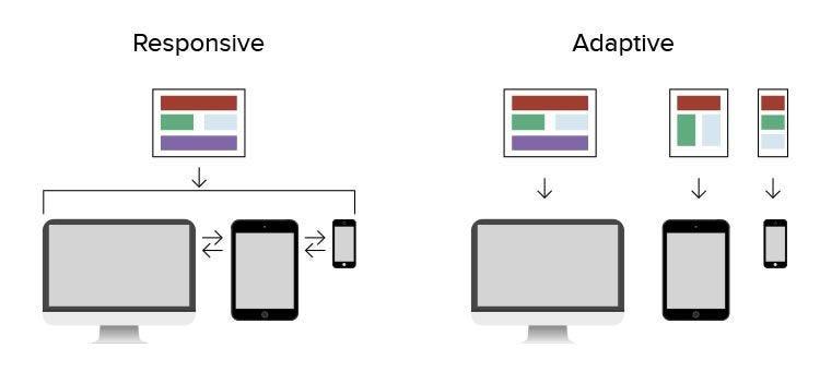
Today, every business that runs a website or app must think beyond a single screen. Users move from mobile to desktop, from tablet to wearable, sometimes within the same task. That’s why Adaptive UX plays such a meaningful role in modern product design. When interfaces adjust smoothly to different devices, users feel confident, supported, and more willing to complete tasks or transactions.
Businesses across the USA small startups, SaaS platforms, ecommerce stores, and enterprise systems all benefit when their product interfaces are flexible and accessible. The goal is simple: design experiences that work naturally wherever your users are.
Why Multi-Device User Experience Matters
Your customers do not use only one device. For example:
They browse on mobile
Compare options on a laptop
Complete checkout on desktop
View notifications on wearable
Stream content on a TV
So your interface must support real-world behavior.
When a product is not adaptive:
-
Users scroll too much
-
Buttons feel hard to tap
-
Forms don’t scale
-
Navigation confuses people
-
Content feels cramped or stretched
But when the design is structured well for each device, engagement improves and frustration drops.
Understanding Device Behaviors (Quick Table)
| Device | Interaction Style | Design Focus | Best Use Context |
|---|---|---|---|
| Mobile | Touch-based | Large tap areas, simple content flow | On-the-go browsing & quick actions |
| Tablet | Mixed gesture & reading | Balanced layouts | Work tools & dashboards |
| Desktop/Laptop | Mouse & keyboard | Multi-column layouts, easy scanning | Research, admin, SaaS |
| Wearables | Tiny displays | Short & clear content | Notifications & reminders |
| Smart TV | Remote navigation | Large spacing, clear focus | Media browsing |
This helps teams plan UX decisions logically.
Strong Product Experiences Through Adaptive UX
Consistency matters. Users should recognize your brand tone, structure, and navigation no matter which device they use.
A solid approach usually includes:
Real user testing
Research-based design decisions
Accessibility standards
Performance focus
Clear content hierarchy
When your UX workflow follows a disciplined structure, users trust your product more and feel supported during every step.
Strategy for Multi-Device Products
Good UX is not only layout content also needs structure.
Prioritize What Matters First
Short, meaningful text helps users complete actions faster.
Use Scalable UI Components
Buttons, cards, tables, menus all should resize smoothly.
Accessible Interaction
Simple color contrast
Readable typography
Comfortable spacing
Accessibility is also good business practice.
Device-Based Testing
Real devices. Real users. Real tasks.
This way, the product performs properly across environments.
Practical Workflow to Apply Adaptive UX
A smooth Adaptive UX design workflow helps your team avoid confusion:
-
Study user behavior
-
Map device journeys
-
Build flexible UI components
-
Test layouts on multiple screens
-
Improve based on analytics
This creates product interfaces that adapt to user context naturally.
Common UX Mistakes That Hurt Usability
Many products struggle because of these issues:
Text too small on mobile
Buttons not finger-friendly
Forms too long
Navigation changing too much between devices
Heavy layouts that slow down loading
Every business should audit these areas regularly.
Measuring UX Success (Important Table)
| Metric | What It Means | Why It Matters |
|---|---|---|
| Task Success | Users finish what they came for | Proves usability strength |
| Conversion Rate | Actions completed | Shows revenue impact |
| Drop-off Rate | Where users leave | Guides redesign |
| Time on Task | Efficiency | Reveals complexity |
| Accessibility Score | Inclusive experience | Builds user trust |
Good UX is measurable not only visual.
Designing for Trust and Clarity
Users rely on interfaces that feel predictable and honest. Small things make a big difference:
Simple navigation
Clear button labels
Familiar layouts
Easy access to support
Clean UI patterns
These elements show users that your product respects their time.
Real-World Example Scenarios
Here are quick situations showing why device-adapted design matters.
1: Ecommerce
A user browses clothing on mobile, adds to cart, completes checkout on desktop.
If the cart does not sync well or UI shifts too much, the sale is lost.
2: SaaS Dashboard
An executive views team stats on tablet in a meeting.
If charts don’t resize, the data becomes unreadable.
3: Booking System
A customer starts booking on laptop and finishes on mobile.
If forms break or reset, frustration rises.
Adaptive structure prevents these issues.
Final Thoughts on Multi-Device Experiences
Adaptive UX Designing product interfaces for multiple devices is no longer optional. Businesses that invest in flexible layouts, structured content, and accessible interaction patterns deliver smoother experiences which leads to better engagement, customer satisfaction, and long-term trust.
Your users deserve interfaces that respond to their needs wherever they are whether at work, home, travel, or on the go.
Written By: Flowmaze UX
Linkedin: https://www.linkedin.com/company/flowmazeux/